Here’s an understatement for you:
I look at a lot of websites.
That’s not so unusual. We all (I’m guessing) look at a lot of websites over the course of a day.
When I look at websites, though, it’s usually with an eye to making them work better and gain their owners more business.
I do a lot of content creation, and a lot of website critiques. And I know what sort of mistakes can make a website lose business right off the bat.
Want to know a secret? It’s pretty much the same ones every time.
In fact, the mistakes that are hurting my clients are probably the same ones you’re making right now.
Here are six common mistakes that small business websites make.
1. Not enough white space
Does your website have too much going on, too much color in the background, or too many graphics?
If so, it is probably difficult to read and tiring to look at. Make your website look more welcoming (and make sure your visitors can find what they’re looking for!) by keeping as much of the background white as possible.
White space on a website is open, restful, and easy to scan.
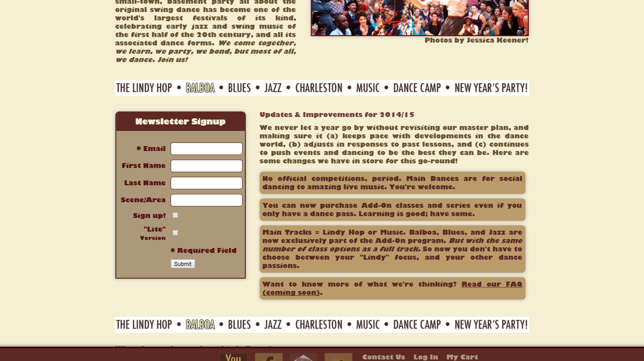
In the screenshot above, you can see the problem with a lack of white space.
The busy pictures, text graphics, and background colors leave no restful place to for your eye to land.
Just looking at the webpage is exhausting, never mind trying to find the information you need. If there were a white background, however, the page would be much easier to read and navigate.
This page is also guilty of problem #2…
2. Odd-looking fonts
Playing with fonts is all right for logos and graphics, but they should still always be readable.
And when it comes to the text of your website, you should always stick with something plain. Times New Roman is good, Arial is even better. Stay away from odd bolding, strange spacing, or weirdly-shaped letters.
You want to keep things as easy to read as possible, and that means a simple font.
3. Large blocks of text
It is a truth that anyone with a website must universally acknowledge: online readers don’t usually read, they skim.
That is, they don’t read every single word and sentence. They scan a page to pull out the information that is most important and relevant to them. When they find it, then they read through it.
If you have large blocks of text, your readers won’t be able to skim and find the information they need.
In fact, their eyes will probably get tired (because reading online text is not like reading a page) and they’ll give up.
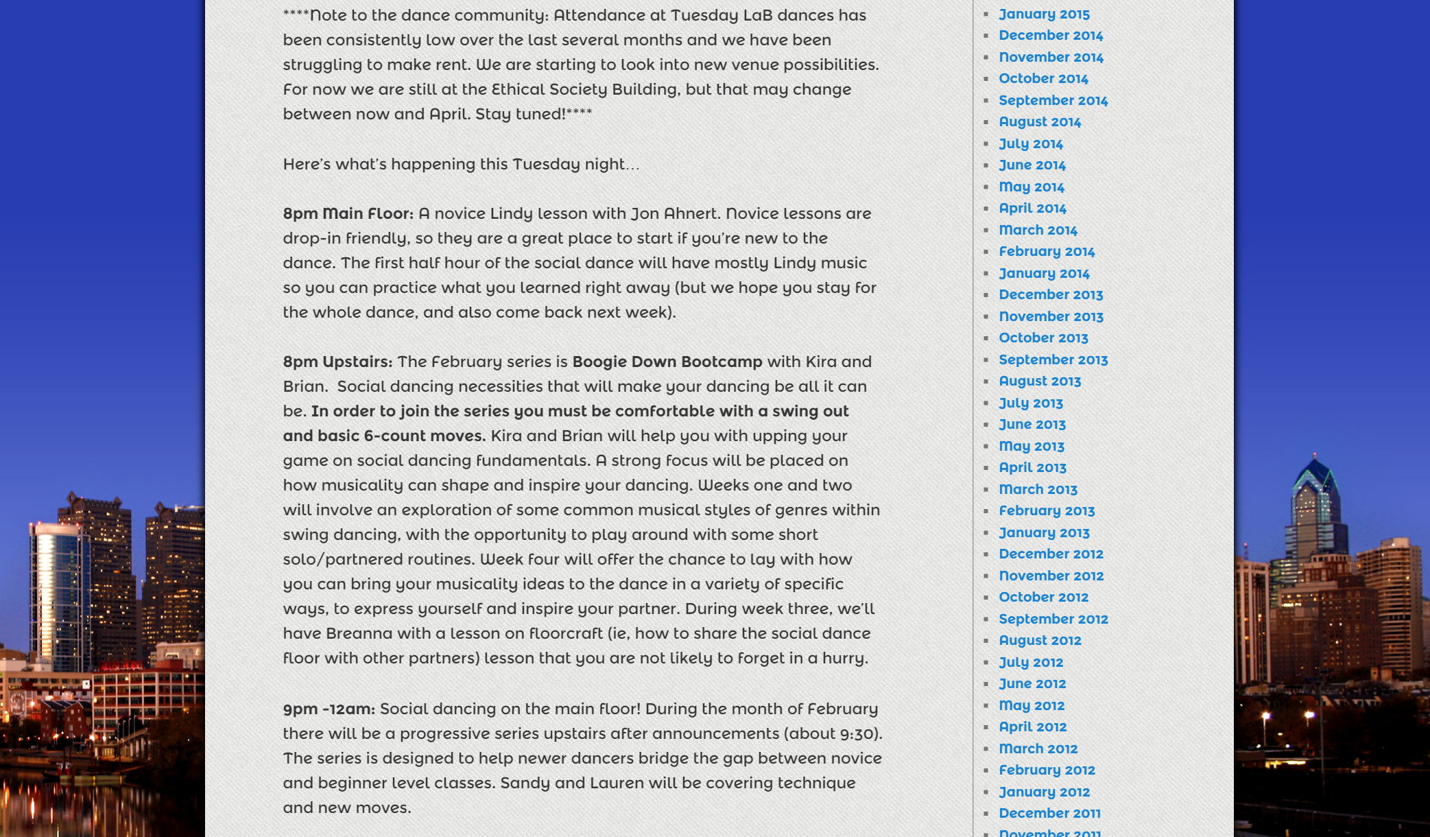
See the example above? See how visually exhausting it is to try to wade through all that information in long paragraphs?
Now, imagine you’re in a hurry, trying to browse during the five minutes you have free before a meeting. Even worse, right?
In general, unless you’re writing a very chatty sort of blog, online paragraphs should be kept to 1-3 short, snappy sentences. Which brings us to problem #4…
4. No bullet points or headings
Breaking up your text is much easier when you use bullet points, numbered lists, or headings.
Lists help your keep your paragraphs short. Headings makes your pages easy to scan and show visitors exactly where the information they need can be found.
Plus a bullet point list in between several paragraphs stands out and indicates, “Here is important information that you should read.” Your visitors’ eyes will go straight to it.
Put critical information in a list and it will almost always be read.
5. Hidden sign-up form (or none at all)
Where does your sign-up form live?
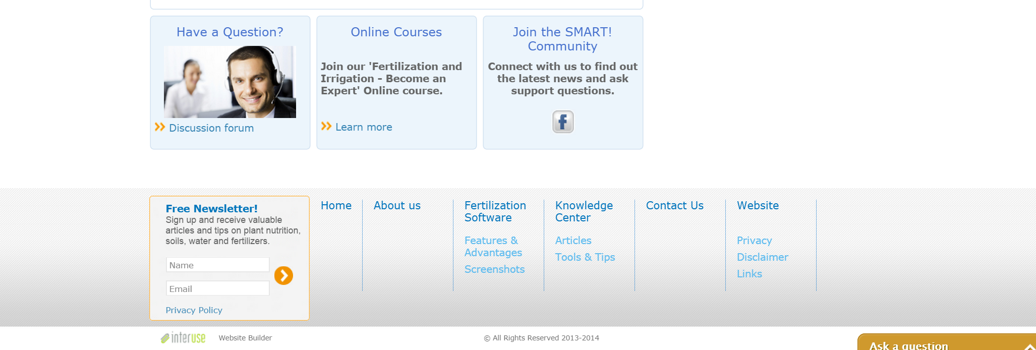
If it’s at the bottom of the page, like the example below, then I can guarantee you’re missing out.
Only a small portion of your readers will scroll all the way to the bottom of your page.
If your email capture lives in the bottom menu, then very few people will ever read far enough to sign up.
Give yourself better odds (and a stronger email list) by putting your sign-up towards the top of the page where every visitor will see it.
Of course, a sign-up form at the bottom of the page is better than no sign-up at all. Capturing emails lets you communicate directly with potential leads.
Don’t miss that opportunity. Put a sign-up form somewhere on your home page and on a couple other pages as well.
6. No clear next step
Every page of your website needs to have a clear goal and a clear next step for visitors to take.
The above about page is a dead end: readers get to the bottom and have nowhere to go next. To keep that from happening to your pages, decide what the goal is before you start writing or designing. Do you want them to…
- read another post?
- sign up for your email list?
- browse your services?
- get in touch?
- schedule a consult?
Know what step you want visitors to take, then make it as easy as possible for them to take it.
Heck, make it stupidly obvious. Tell them what to do next! Guide readers through your website until they become customers, or at least leads.
After all, that’s the point of a website, isn’t it?
*****
Need a little more help making your small business stand out online?
I’ve got a whole library of free resources designed just for small business owners like you!
If you have a particular struggle with your small business, whether that’s content marketing or cold-emailing new prospects, I’ve got something that can help:

I came over here from the Careful Cents Facebook group. I’m glad I did! You made me re-think my website and how it’s laid out.
I was guilty of #6. My sign up form was there, but too far down the page. I corrected that and made the content more visually appealing, particularly by shortening paragraphs and bolding certain sentences to draw the eye to the important points.
Thanks for your great tips, Katherine!
Glad you found some ideas to help you out! And believe me, I’m guilty of these things all the time too — I have to remind myself to go back through blog posts and break things up every.single.time.
I also didn’t have a well-placed email sign-up for the longest time, in spite of constantly telling clients to make theirs easier to find!
I also came over from The Careful Cents club. Love this post — all fantastic tips that I’ll be sharing with my clients and followers.
At the end of the day, you need to understand how your reader engages with your site, and cater to these needs. This includes making it easy for them to skim posts, as you mention, and walking them through that next step. I recently launched my site and have been trying to check off all of these points, but there’s always room for improvement. 🙂
You’re so right about focusing on what the reader needs — that should inform every part of the process from format to content to delivery!
And it can actually make decisions a lot easier. Whenever you’re unsure what to write or focus on or produce, just thinking about who your readers (or clients) are and what will help them the most usually provides the answer!
Like Janai and Charlottaway I’m also a member of the Careful Cents Facebook group.
Thanks so much for this post it’s great – clear, informative, practical and brief. It’s also incredibly helpful for me because I’m in the process of writing copy for my first website!
Your site’s a brilliant example of the points you’ve made because it’s visually attractive, easy on the eye and clutter-free.
Glad it was so helpful Dawn! And thanks for your kind words about my own site. If you’re putting together your website and would like some feedback, I’ll be offering free mini-critiques to people on my mailing list soon. Be sure to sign up!
I need to fix everything, lol. I must have found you on Careful Cents also, but honestly, I’ve been consuming everything I can get my hands on and now have information overload! I find what you have to say very helpful though, so I will try to take the steps to fix my blog, website, whatever I’m calling it today. (I previously tried to turn my blog into a website but failed obviously). I’m sure I can’t do everything I need to do for free, it’s working somewhat but not if I want a freelancing business. Thanks again for all your valuable resources!
I’m glad you’re finding everything helpful, Kim! And I 100% understand what you mean about information overload. I find it’s generally helpful to pick one goal or task, a single resource that’s provides relevant information, and stick with it until the task is complete. Otherwise, it’s too easy to spend all your time consuming information and not do anything with it!
If you would like to take a good deal from this post then you
have to apply such techniques to your won web site.